

Looking to the future of beauty, we see technology, water scarcity, ingredient sustainability and overall environmental responsibility all influencing consumer behavior and their brand choices. While natural and organic ingredients continue to hold the spotlight, so, too, is there an increasing reliance on green chemistry. Now is the time to tackle these upcoming skincare trends as you plan out your upcoming year.
More and more indie brands are successfully finding their way into the market, and the big international brands — as well as consumers — are paying attention. Instead of radio and TV commercials, social media and digital marketing are driving consumers to online and brick and mortar stores. Indie beauty brands are coming to market every week and competition is fierce to stand out from the crowd. We’ve done some research here to pull together what we see as some of the emerging 2019 trends. Hopefully, they will inspire you to look at your brand, your products, and your marketing to take advantage of these trends and delight your customers.
But first, let’s play with color!
Pantone’s 2019 Spring/Summer Palette is here and it’s all about uplifting, empowerment and more than a little bit of fun. Pulling many of the names from nature, Pantone is leveraging consumers’ desire for natural products from food to fashion, and that includes their skincare.
Pantone Color Institute’s executive director Leatrice Eiseman said, “From a psychological standpoint, when you look at what the colors mean, the hotter colors particularly in the red family are all about empowerment. That’s a word that has gotten some play that is really going to show itself in the spring collections. Confident, uplifting, joyful hues, but the undercurrent is empowerment to all of them.” Combined, they also help to meld high fashion and street style, a trend which has shown no signs of going away.
Colors such as Mango Mojito, Living Coral, Pepper Stem, and Aspen Gold all bring us back to nature. Terrarium Moss and Turmeric are bold yet grounding, and together this powerful palette is a win/win for anyone who loves color.
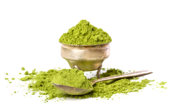
Take Turmeric specifically:
This “enlivening” hue’s name plays to the fact that there are more exotic spices in foods with the takeaway being a more appetizing appeal. “As colorists and forecasters, we pay close attention to the food industry because it gives you a lot of information about what is going to be appealing to people, what they’re reading about and what might be tempting to them,” Eiseman said. “When you use the word ‘tempting,’ it can tempt the tongue but also tempt the eye. In fashion, that obviously is an important issue.” And beauty brands are already on board with turmeric face masks and other products.
Neutral colors are far from boring, and they, too, are pulling from nature: Eclipse, Soybean, Brown Granite and Sweet Corn.
2019 Skincare Beauty Trends
- Beauty from the Inside Out
There is steadily growing popularity in adding self-care, health, and wellness as part of one’s beauty routine. Companies are adding vitamins and ingestible products to their beauty offerings, and they are promoting a full, healthy lifestyle as part of the ‘beauty from the inside out’ trend. - Natural Ingredients
The push for products made from natural ingredients is both driving the natural and organic market, but also stressing the environment. This puts pressure on indie beauty companies to balance the need for natural ingredients with the reality of commodity pricing and availability. The crop failure of French lavender last year is a key example. Prices are going up every month and there is less pure, high-quality French lavender EO available. This is also driving big companies to purchase farms and/or the yields of farms for years in advance. - Who am I? Who are you?
Conscientious consumers are on a journey of exploration; self-exploration as well as an exploration of brands and retailers who meet their needs and their values. The generational shift by younger consumers who are rejecting larger brands that had once dominated the market is a key indicator of this trend. The newer generations prefer seeking out more locally-made, artisanal, and natural products. This has also led to a change in how consumers are finding new products, preferring social media and influencer marketing over traditional marketing platforms like TV and radio. - Standing out in a crowd
It has always been true that brands need to catch the attention and time of consumers. Now, more than ever before, successful brands will need to focus not just on great products, but on innovation, creativity, authenticity, and design. Your product, its packaging, and your marketing all must present a unified and interesting story. One way to do that is to focus on a hero product that represents your brand, delivers your mission, and can boast a loyal group of followers. And of course, you must deliver on the promises your product makes. - Value
Not only do consumers want innovative, high-quality products, they’re also looking for the best value for their money. That doesn’t necessarily mean you have to be the cheapest on the market. But you do have to make the case for why buying your product is actually a good value. This means your product has to have something that makes it stand out and that the promises your product offers are worth the money you’re charging. It also means you’ll need to think through pricing strategies based on where you’re selling, who you’re selling to and the competition selling to your same customer base. This will all affect how you package, market and promote your product.
Skin & Hair Care Trends:
Natural Skincare: The skin and hair care segment of the market continues to explode with more natural, organic, clean, green, and even food-standard products. This includes following food trends like vegan plant-based diets and the use of superfoods. Consumers want shorter, more transparent ingredient decks they can understand, without the inclusion of toxic or synthetic chemicals. This is especially applicable right now for personal hygiene products such as deodorants, as well as anti-aging products for both skin and hair.
A note of caution, however. Creating USDA Certified Organic hair care products is challenging. There are no organic surfactants other than Castile — which is harsh to skin and hair — and soap nuts, which have a very strong smell. Also, ingredients with long, complex names are often natural ingredients with great benefits. So adding some education along with your product lines can go a long way to helping your customers make great choices.
Probiotics: Skincare tends to follow suit with the food industry trends, so with the increasing focus on foods containing probiotics such as yogurt, kimchi, and kombucha, it was only a matter of time before the trend found its way into the skincare market. Topical probiotic products are on the rise, but finding manufacturers who can create functional probiotic products can be incredibly tricky due to preservation, and brands should choose wisely.
Heatwave Beauty: It is possible the sun-kissed, windswept beach wave look may never go out of style. Tinted moisturizers, bronzers, self-tanners, and hair texturizers all work in harmony to help create that “I just got home from my California beach vacation” look.
Tools and Devices: There is a growing demand for tools to accompany products as well as actual facial workouts to tighten and tone. From cleanser and foundation application tools such as the Clarisonic and Beauty Blender to derma rollers, gem rollers, and facial massagers meant to promote circulation and reduce the appearance of fine lines and wrinkles, consumers are spending time daily at the “face gym”. There are also phone attachments for scanning skin tone, LED light therapy devices, at home laser treatments, temperature controlled wands and devices like the Foreo UFO Mini meant to help skin better absorb expensive products such as serums, and actives from sheet masks and other like products.
Pre-Shampoos: Adding this new step in the traditional haircare regime is on the rise. These products are to be used prior to traditional shampooing and are meant to deeply exfoliate and hydrate the scalp and roots prior to washing and formally conditioning. This is said to help your hair maintain its “good oils” during the washing process, which can often leave hair stripped and dry. A great example is the Kerastase Chronologiste Revitalizing Exfoliating Pre-Shampoo.
Makeup Trends:
Makeup continues to get its own makeover with the addition of skin loving ingredients and ‘actives’ to makeup products. These vary from vitamin-enriched foundations to setting powders enhanced with hyaluronic acid. Once the skin is happy, makeup can really shine.
The Doll Look: Represented by heavy makeup to create an almost porcelain-like appearance that is sometimes not meant to look natural. Achieving this look can easily require the use of more than ten individual products from primer all the way to setting spray. These are your full coverage-loving full glam-dominating artists! Big false lashes, perfectly carved out brows, excellently placed contour and highlight, and eyeshadow gradient perfection.
The “No Makeup” Makeup Look: Opposite of the Doll Look, this trend involves showing off beautiful skin naturally by using minimal products that are designed to enhance rather than cover. Big natural brows, long lashes, tinted moisturizers, and a healthy glow highlighter. Maybe a touch of crème blush and a neutral lip. The consumers driven by this trend are looking for that perfect blend of makeup and skincare with an emphasis on vegan and organic makeup.
Ingredient Trends:
Feed your Skin: Ingredients like turmeric, hemp, quinoa, red raspberry oil, matcha, organic sugar, pumpkin, pomegranate, coconut oil, and Himalayan salt are all ingredients that enrich our tables, and now our skin wants a bite at the, well, apple, too. Organic fruit powders including banana, apple, pomegranate, and coconut water are showing up in masks, body sprays, serums, and aloes.
Toxic Free: Consumers want natural wherever possible. With the only exception being certain makeup products as mentioned before, the demand for nontoxic, all natural and organic ingredients continues to rise. Though it can make formulation more challenging, consumers are still looking for products that do not contain parabens, phalates, gluten, sulfates, synthetics, and more. Preservatives also have a ‘bad rap’ but before you throw them out, be sure you’re creating a safe product for your customers.
Water-Free: As water becomes a more protected resource, brands will have to make considerations for how that will impact their product choices. We will most likely be seeing an increase in anhydrous products, as well as more transparency on where the water used in emulsions comes from.
More Actives: Consumer want products that perform. Similar to the vitamin and natural supplement industry, consumers are starting to question the percentage of active ingredients in a product and are becoming more aware of what levels of an ingredient must be present for a product to be effective. Brands are moving away from fairy dusting a long list of active ingredients, and are instead opting for a higher percentage of a single — or smaller number — of ingredients. So instead of a single serum that has a little of everything, brands might consider creating multiple products with higher concentrations of each individual active ingredient. A powerhouse example of this done successfully is The Ordinary Company.
Non-GMO: Again this trend follows the world of food and the rise of Non-GMO as a desired trait. Consumers still put a negative stigma on genetically modified organisms, and if you’re selling into Europe, it’s especially important. You do not need to be certified Non-GMO through the Non-GMO project, but you’ll want to know if this is important to your brand. A note of caution: certification is a beast and can be very expensive.
Vegan: Although not a new trend, vegan has become almost a ‘must have’ for most skincare companies. Few ingredients will really cause you any issues: honey, beeswax, silk, goat’s milk — these are a few of the non-vegan options you may have to compromise on. But the collapse of the bee population and the focus on plant-based lifestyles are putting vegan at the front of the trend line.
More Trends:
Whole Body Skincare: Masks, serums, and other products that used to be marketed and used only on the face are now being used all over the body, even the bum! Full body care is from head to toe, and treating the skin on your body as well as you treat the skin on your face.
Gender Neutrality and Men’s Makeup: Releasing of strict gender rules in beauty. Slowly saying goodbye to the “FOR MEN” labeling on many products meant for men, as if they needed permission to use it. Brands clearly identifying as unisex, or simply providing marketing and packaging that does not fit into a stereotypical pink vs steel grey and blue, and are meant for everyone and anyone. Chanel even recently launched a revolutionary line of three makeup products for men called “Boy De Chanel” that includes a foundation in four shades, a brow pencil in four shades, and a matte lip balm.
Topical Cannabis Products: As cannabis continues to become more mainstream, and the healing property claims continue to gain traction amongst consumers, the demand for topical options is growing at a rapid rate. Cannabidiol (CBD) is not the same as Tetrahydrocannabinol (THC), and does not get the user “high”. Thus CBD oil has grown enormously in skincare products, with benefits touted widely.
Inclusivity/Diversity: The current consumer market for beauty has a growing demand for full inclusivity of products. This means that companies need to ensure that their products are not formulated or marketed for/to only a small portion of the consumer market, but that they are offering options that can be used/seen by a larger market segment. The best example of this in recent months was the release of Rihanna’s Fenty Beauty line, where she released a massive collection of 40 shades of foundation to ensure that everyone would be able to find a shade that worked for them. Appealing to the widest market possible can be challenging as a small brand, but as you grow it’s a skincare trend you can’t ignore.
More Reality and Transparency: The days of celebrity endorsements and over-edited imagery may not be fully behind us, but the current consumer market responds much better to relatable and realistic men and women trying, testing, endorsing, and selling products. Relatability, transparency, honesty, and authenticity is very in. (Did you see everyone freaking out about a razor company advertising using the product on legs that were actually hairy before shaving?)
UVA and UVB Protection: The growing popularity of SPF can’t be ignored, whether in makeup, lotions, or simply standalone sunscreen. Wearing products with SPF has finally been embraced by mass markets, and although it requires special (and challenging) certification to legally call a product ‘SPF’, people use it in multiple products, everyday. Although it’s a harder market to tap because of those certification requirements, it is definitely expanding. A parting thought: widely publicized bans on certain ingredients in sunscreen mean this market, too, is turning towards more thoughtful ingredients. Certainly anyone visiting Hawaii will need reef- and fish-safe sunscreens!
Customization and Personalization: This means using technology and data as well as consumer inputs to create products for a specific target market or even on an individual consumer basis. Using tech to create customizable and personalized makeup, haircare, and skincare. As consumers continue to track their health and wellness with wearable and other useable technology, beauty will eventually follow. Below are some great examples:
- Lancome – custom-blended foundation made just for your skin tone and needs.
- Made-to-Fit by BareMinerals – The innovative brand is powered by an app that allows you to scan various spots on your face and forearms at home to make sure you’re getting a 100 percent match-able foundation shade delivered to your door. Includes Customer name written on bottle.
- The Body Shop – Foundation lightening or darkening drops. If you are experiencing a seasonal change in skin tone, these drops will lighten or darken your favorite formula
- Madam C.J. Walker Custom Hair Masque Cocktail Kit – This kit will keep your hair in tip-top shape. With brassica seed, coconut and Jamaican black castor oils and a deep conditioning masque, there are endless “cocktails” you can mix up based on your hair needs.
- Function of Beauty – algorithms and equations to create fully customized hair products based on your very own #hairgoals.
- Bare Minerals “Mix. Exfoliate. Smooth” – Add-To-Cleanser skin polishing microbeads that can be added to your favorite cleanser(s) to use them as a single use exfoliator.
- Nip+Fab Skin Shots – Shots that can be added to your favorite moisturizers, face masks, eye creams and so forth, based on what you’re in need of that day.
Packaging and Visual Trends:
The packaging business is changing. Not just in the beauty industry, but in general as we move together towards more sustainability. Environmental pressures combined with rising costs in both materials and manufacturing is finally forcing a downsizing in packaging, especially in the beauty industry. And since a brand’s packaging is as important as the product(s) inside it, brands needs to start thinking about how to achieve these goals while staying true to their brand and mission.
Think clean packaging, sustainably sourced. You’ll be seeing smaller sized, easy-to-use — and often reusable — containers with added functions while also being environmentally friendly, recyclable, biodegradable, reusable and/or repurposed.
When creating visuals, it is important to embrace the obvious changes in conventional standards of beauty. Using interesting and different people when creating visuals is a must. This plays into diversity and inclusivity, and when paired with the below trends, can make a world of difference in your brand’s authenticity and appeal. We are sure to see more simplicity, pastels & neutrals, artsy, vintage, larger fonts, vibrant colors, and interesting shapes when it comes to packaging and other marketing material.
Challenges facing beauty brands in 2019
Even with an amazing product by your side, 2019 poses new and interesting challenges for brands and evolving skincare trends. It is not enough to have a product that works, packed inside eye-catching packaging, available for purchase at a reasonable price on a beautiful — and easily-navigated — website. Brands need to be able to tell their stories and to get new products to market while they remain relevant.
Yet formulation research and development take time. And so, too, manufacturing takes time. Planning well in advance and working closely with your manufacturer on next year’s products is key. You can’t bring new products to market without research, market testing, stability testing, and oh yes, great packaging and design.
Getting to market quickly with your product must involve a conversation about where you’ll sell your products. Leveraging Amazon and other online marketplaces is one way to get in front of millions of consumers more quickly than picking up retail stores. But Amazon has its own challenges with new rules for skincare, the costs you’ll give up to Amazon, and competition. Having your own website puts more money in your pocket, but means you’ll do all the work driving traffic to your website.
Hopefully this broad overview has inspired you when it comes to your own brand, and perhaps reaffirmed your confidence in the development of your products. There’s no time like the present, so we encourage you to find one (or multiple!) of these skincare trends and make it your own.
2019 New York Fashion Week Pantone